您现在的位置是:网站首页> 编程资料编程资料
CSS网页响应式布局实现自动适配Pc/Pad/Phone设备CSS像素以及移动端不同屏幕适配问题解决postcss-pxtorem移动端适配的实现css列表滑动防止被底部遮住和适配屏幕长一点的机型处理 CSS3中媒体查询结合rem布局适配手机屏幕手机端用rem+scss做适配的详解通过CSS3的object-fit来调整图片适配尺寸的技巧简介利用css @viewport 做设备适配
 2023-10-18
465人已围观
2023-10-18
465人已围观
简介 这篇文章主要介绍了CSS网页响应式布局实现自动适配Pc/Pad/Phone设备,文中通过示例代码介绍的非常详细,对大家的学习或者工作具有一定的参考学习价值,需要的朋友们下面随着小编来一起学习学习吧
前言
现在的设备很多,有PC、iPad、手机、智能手表、智能电视。如果没有响应式布局,那么电脑网页在手机或者ipad上显示,是体验非常差,操作不方便,视觉疲劳的,所以我们开发网页要做好响应式布局。
index
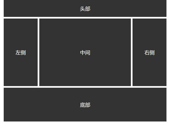
响应式布局 头部左侧中间右侧
CSS
*{ margin: 0; padding: 0; } /*适应PC端 宽度大于1000px*/ @media screen and (min-width: 1000px) { #content{ width: 960px; margin:0 auto; } #header{ width: 100%; line-height: 100px; float: left; background: #333; color: #fff; text-align: center; font-size: 30px; margin-bottom: 10px; } #left{ width: 200px; line-height: 400px; text-align: center; background: #333; float: left; font-size: 30px; color: #fff; margin-right: 10px; } #center{ width: 540px; line-height: 400px; text-align: center; background: #333; float: left; font-size: 30px; color: #fff; } #right{ width: 200px; line-height: 400px; text-align: center; background: #333; float: right; font-size: 30px; color: #fff; } #footer{ width: 960px; height: 200px; background: #333; color: #fff; line-height: 200px; font-size: 30px; text-align: center; float: left; margin-top: 10px; } } /*适应pad端 宽度在640-1000之间*/ @media screen and (min-width: 640px) and (max-width: 1000px) { #content{ width: 600px; margin:0 auto; } #header{ width: 100%; line-height: 100px; float: left; background: #333; color: #fff; text-align: center; font-size: 30px; margin-bottom: 10px; } #left{ width: 200px; line-height: 400px; text-align: center; background: #333; float: left; font-size: 30px; color: #fff; margin-right: 10px; } #center{ width: 390px; line-height: 400px; text-align: center; background: #333; float: left; font-size: 30px; color: #fff; } #right{ width: 600px; line-height: 300px; text-align: center; background: #333; float: left; font-size: 30px; color: #fff; margin-top: 10px; } #footer{ width: 600px; height: 200px; background: #333; color: #fff; line-height: 200px; font-size: 30px; text-align: center; float: left; margin-top: 10px; } } /*适应移动端 宽度小于640*/ @media screen and (max-width: 639px){ #content{ width: 400px; margin:0 auto; } #header{ width: 100%; line-height: 100px; float: left; background: #333; color: #fff; text-align: center; font-size: 30px; margin-bottom: 10px; } #left{ width: 100%; line-height: 150px; text-align: center; background: #333; float: left; font-size: 30px; color: #fff; margin-bottom: 10px; } #center{ width: 100%; line-height: 300px; text-align: center; background: #333; float: left; font-size: 30px; color: #fff; } #right{ width: 100%; line-height: 150px; text-align: center; background: #333; float: left; font-size: 30px; color: #fff; margin-top: 10px; } #footer{ width: 100%; height: 200px; background: #333; color: #fff; line-height: 200px; font-size: 30px; text-align: center; float: left; margin-top: 10px; } }通过@media screen and (限制范围) 来控制网页的布局,例如
min-width代表最小的限制,max-width代表最大的限制。
PC端
Pad端

Phone端

以上就是本文的全部内容,希望对大家的学习有所帮助,也希望大家多多支持。
相关内容
- css中有序无序列表项list样式设置方法CSS字体、文本、列表属性详细介绍CSS 有序或者无序列表的前面的标记 list-style-type 属性的实现使用CSS计数器美化数字有序列表的实现方法
- 纯CSS实现鼠标放上滑动出半透明效果的文字说明(新手小白 必看)css实现背景半透明文字不透明的效果示例纯css实现背景图片半透明内容不透明的方法利用CSS3制作简单的3d半透明立方体图片展示用CSS设定一个元素半透明css3实现的半透明遮罩lightbox效果源码纯CSS实现多级半透明效果菜单代码
- 在Firefox浏览器中利用CSS窃取数据CSS Transition通过改变Height实现展开收起元素从QQtabBar看css命名规范BEM的详细介绍css实现两栏布局,左侧固定宽,右侧自适应的多种方法CSS 实现Chrome标签栏的技巧CSS实现两列布局的N种方法CSS实现隐藏搜索框功能(动画正反向序列)CSS3中Animation实现简单的手指点击动画的示例详解CSS中的特指度和层叠问题详解overflow:hidden的作用(溢出隐藏、清除浮动、解决外边距塌陷)关于CSS浮动与取消浮动的问题
- css3针对移动端卡顿问题的解决(动画性能优化)CSS 阴影动画优化技巧浅析与CSS3的loading动画加载相关的transition优化
- css选择器四大类:基本、组合、属性、伪类详解css3中的伪类before和after常见用法CSS伪类:empty让我眼前一亮(实例代码)浅谈CSS 伪元素&伪类的妙用CSS 伪类修改input选中样式的示例代码css伪类 右下角点击出现 对号角标表示选中的示例代码详解如何使用CSS3中的结构伪类选择器和伪元素选择器解决移动端跳转问题(CSS过渡、target伪类)css3 伪类选择器快速复习小结CSS新增的:where和:is伪类函数是什么
- border-radius IE8兼容处理的方法使用CSS的border-radius属性 设置圆弧一个关于border-radius值设置的问题记录css3 border-radius属性详解浅析border-radius如何兼容IEIE系列不支持CSS的圆角border-radius等属性的解决方案
- css3实现圆锥渐变conic-gradient效果CSS3颜色值RGBA与渐变色使用介绍css实现透明渐变特效的示例代码通过css3背景控制属性+使用颜色过渡实现渐变效果css3实现背景动态渐变效果CSS 实现渐变效果小结( linear-gradient线性渐变 和 radial-gradient径
- 疯狂猜图 一个黄色的圈里面一朵褐色的梅花 答案是什么_手机游戏_游戏攻略_
- 疯狂猜图 橙色瓶身一个闪电 答案是什么_手机游戏_游戏攻略_
- 疯狂猜图 一个红色碗里两个鸡腿 答案是哪个品牌_手机游戏_游戏攻略_